Welcome to the June 2024 update.
Here are a few, select highlights for Fabric. Fabric Spark connector for Fabric Data Warehouse in Spark runtime is now available. Query activity, a one-stop view of your running and completed SQL queries for workspace admins is being announced. You can now run queries in a KQL Queryset and pin the results directly to your Real-Time Dashboard, whether it’s new or existing.
There is much more to explore, please continue to read on.
Attention Power BI users!
If you are accessing Power BI on a web browser version older than Chrome 94, Edge 94, Safari 16.4, Firefox 93, or equivalent, you need upgrade your web browser to a newer version by August 31, 2024. Using an outdated browser version after this date, may prevent you from accessing features in Power BI.
Reporting
Visual calculations update (preview)
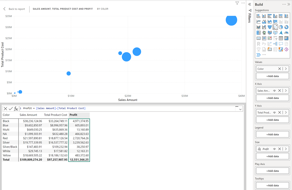
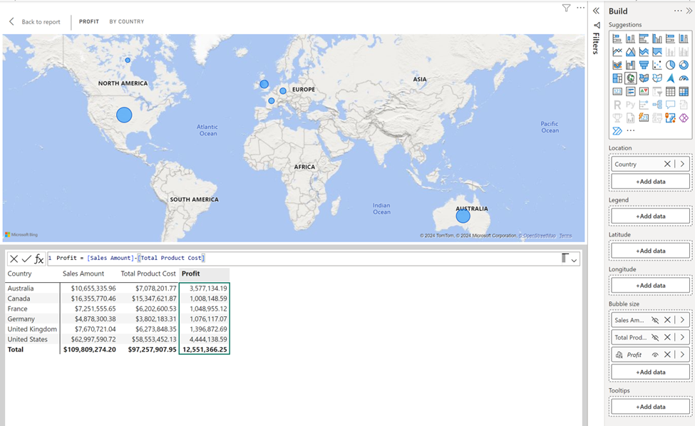
Support for scatter plot and maps
Scatter plots and maps are now supported with visual calculations! This means you can now add visual calculations to these visual types. Please note that the play axis is not yet supported.
Highlights in visual matrix
If you look closely at the previous screenshots, you might notice they have added a highlight to the visual matrix to indicate which visual calculation you are editing. They plan to rely on the visual matrix to make working with visual calculations even easier in the future. This highlight is just the first step of their plans.
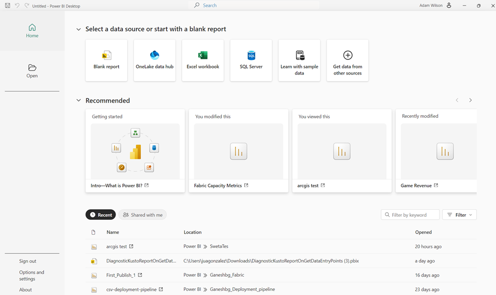
Power BI Home in Desktop is now generally available
The new Power BI Home in Desktop is now generally available! Introduced last February, this update brings new functionalities that make it easier for users to create reports. With data sources directly accessible from the home screen and enhanced discoverability features like the recommendation section and the quick access list, getting started is simpler than ever.
Check out the documentation to learn more about all the new features.
Modeling
Download large semantic models
You can now download your large semantic models to Power BI Desktop as a .pbix file! Previously you could only edit reports connected to these models in live connected report mode. Now you can open and edit your reports and the large model itself as a .pbix file all within Desktop! This unlocks the full end to end Desktop authoring experience you know and love for your large semantic models.
Learn more information including limitations in the documentation.
New INFO functions and DAX query view improvements
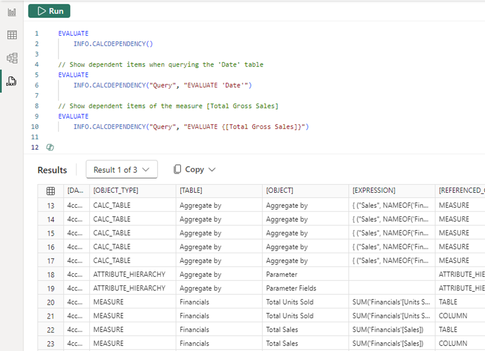
New INFO functions are available June 2024. All the INFO functions are DAX function versions of existing Analysis Services Dynamic Management Views (DMVs), so that documentation is provided here for additional information.
All INFO functions can now take optional input parameters. As DMVs these optional input parameters are called restrictions. For all the INFO functions this includes their columns, but some have additional restrictions. INFO.CALCDEPENCY can specify QUERY as one if it’s restrictions, or optional input parameters, allowing you to analyze the items in the semantic model needed for that DAX query. This is helpful when analyzing what is being used by the semantic model in a DAX query from a visual in a report.
For example, these are valid uses of INFO functions with and without the input parameters:
Learn more:
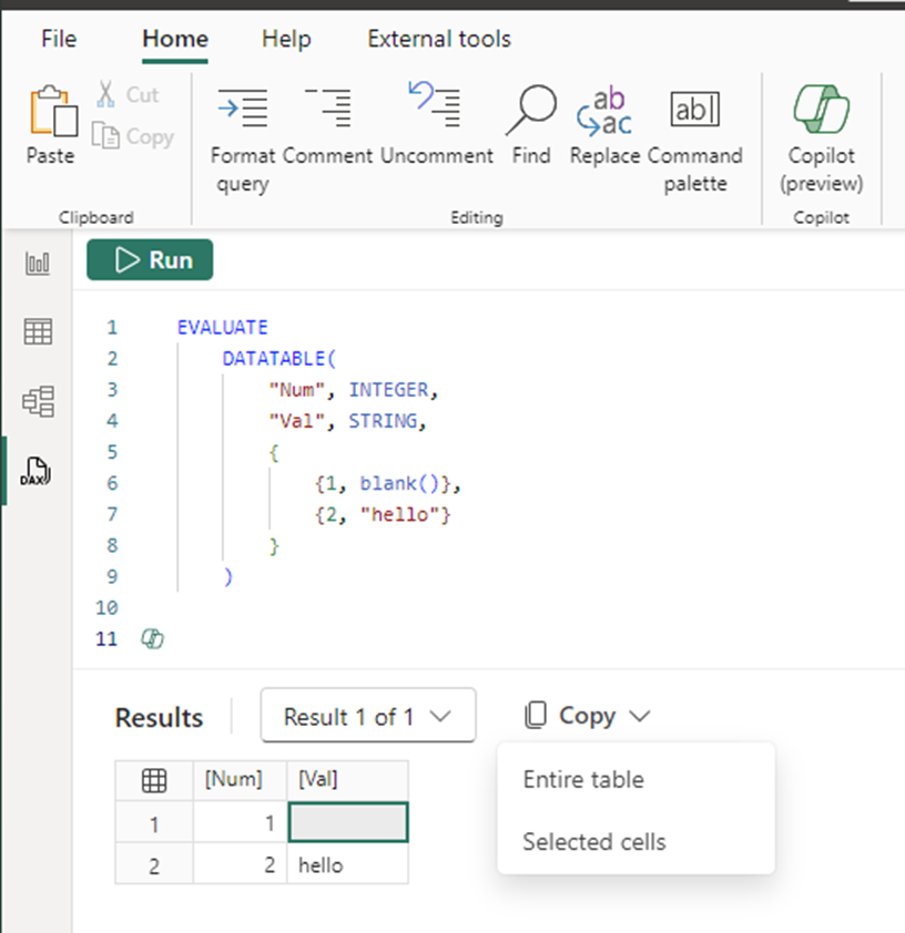
Additionally, a bug with the copy functionality of the results grid has been fixed. Previously, if the results included a blank cell the copy did not work. Now copy works with blank cells, and they included a right-click copy as well as the option to choose if you want to copy the entire table or just the selected cells from the copy button.
Copy > Entire table will include the headers. Copy > Selected cells by selecting all the cells, including if you click the table icon in the top left of the results, will not include the headers.
Mobile
Show Visuals as Tables (Preview)
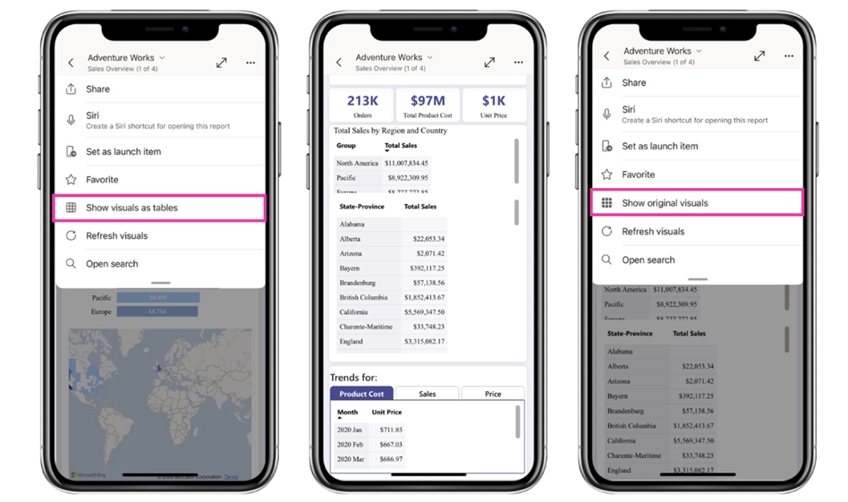
They strive to make the Power BI mobile app as accessible as possible for everyone. That’s why, in this month’s update, they’ve added the Show Visuals as Tables view mode to all reports. Use this feature to instantly view all the visuals (excluding slicers, cards, and non-data-driven visuals) in your report as table visuals. This feature makes it possible for users who rely on accessibility screen readers to read the underlying data presented in each visual. It also benefits users who prefer to see their data in tabular form, which is more like viewing it in Excel.
To turn on the Show Visuals as Tables view mode, tap the new button that has been added to the options menu (…) in the report header. The view mode is applied to all pages in the report. To go back to the regular view, tap Show original visuals in the same menu.
Developers
Power BI enhanced report format (PBIR)
The Power BI enhanced report format (PBIR) for Power BI Project files (PBIP) has now been announced. This marks a significant milestone in achieving the primary goal of Power BI Desktop developer mode: provide source control friendly file formats that unblock co-development and enhance development efficiency.
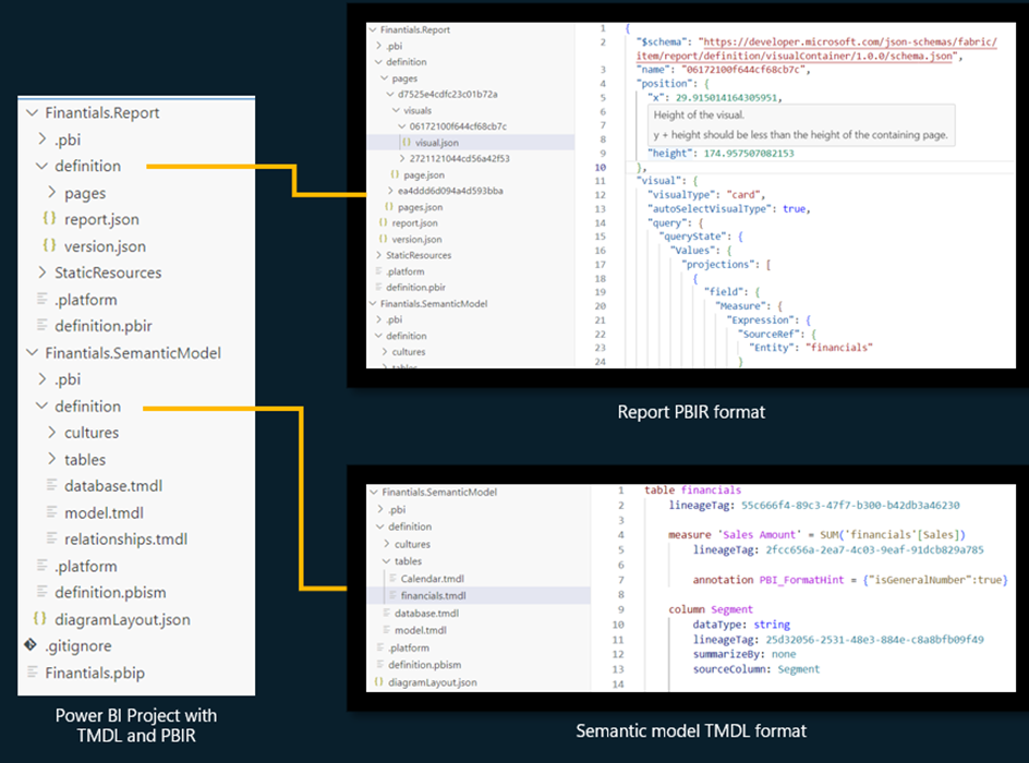
Power BI Projects (PBIP) now support saving the report and semantic model into a folder using source-control friendly formats: PBIR for the report and TMDL for the semantic model.
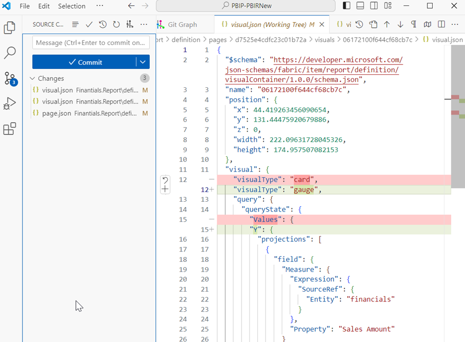
The PBIR file format greatly simplifies the tracking of changes and resolution of merge conflicts by using properly formatted JSON and organizing each visual, page, bookmark, etc., in separate individual files within a folder structure.
You can also greatly enhance your report development efficiency, either by simply copy & paste visuals/pages/bookmarks/… files between reports or apply manual/programmatic batch changes to the PBIR files.
Unlike PBIR-Legacy (report.json), PBIR is a publicly documented format and allows modifications from non-Power BI applications. Each file has a public JSON schema, which documents each property and lets code editors like Visual Studio Code perform syntax validation while editing. On open, Power BI Desktop will validate the changed PBIR files to guarantee successful loading.
How to enable it?
PBIR is currently in preview, and you can only create or convert existing Power BI project files to PBIR using Power BI Desktop. You must first enable the feature in Power BI Desktop preview features: go to File > Options and settings > Options > Preview features and check the box next to “Store reports using enhanced metadata format (PBIR)”.
During preview, Fabric Git Integration and Fabric REST Apis will continue to use PBIR-Legacy (report.json) when exporting the report definitions. However, if the report is imported into Fabric using PBIR format, then both features will start exporting the report definition using PBIR format. At General Availability, PBIR will become the default report format.
Limitations
Initially, the PBIR format will have some service restrictions, such as:
- Unable to publish the report in Power BI App.
- Unable to use subscriptions.
- Unable to download PBIX.
These restrictions will be removed in the following months.
Find out more about PBIR and the limitations of Public Preview in the documentation.
Visualizations
New visuals in AppSource
vuurmans_custom_polar_area_chart
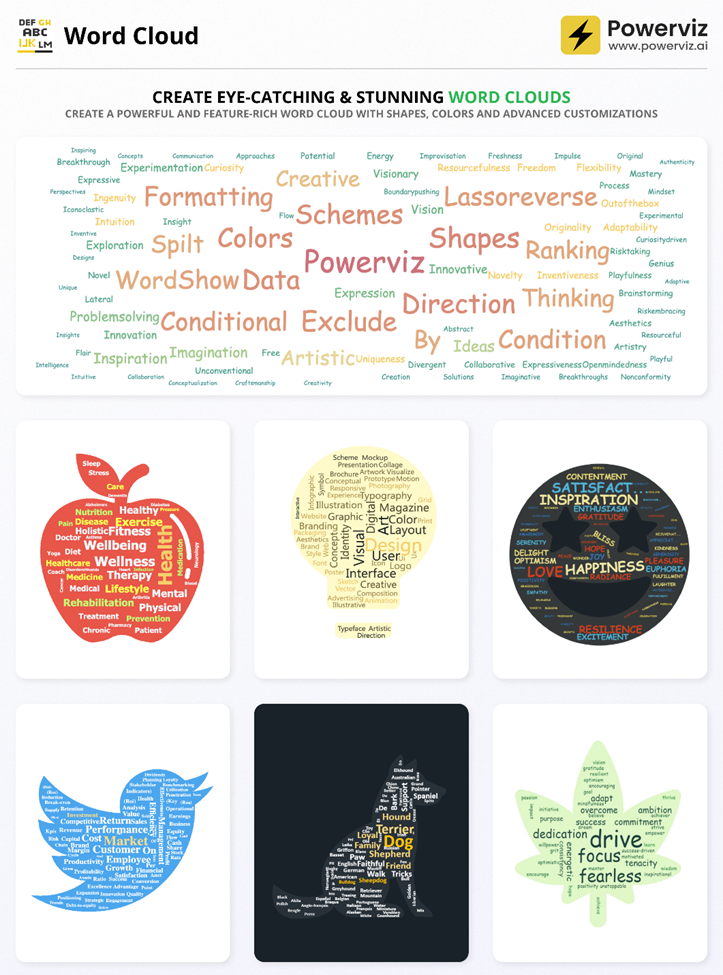
Word Cloud by Powerviz
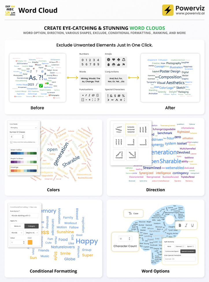
Powerviz’s Word Cloud is a visual representation of text, with word size indicating frequency or importance in the given content. It offers a quick overview of key themes and is commonly used in presentations and data analysis to highlight patterns and key terms.
Key Features:
- Word Options: Customize text styles and appearance.
- Direction: Control word orientation with various styles.
- Colors: Choose from 30+ color schemes.
- Shapes: Create unique word clouds with icons and images.
- Ranking: Filter out Top/Bottom N Words.
- Exclude: Easily remove unwanted words, symbols from the text to create a clean and focused word cloud.
- Conditional Formatting: Easily spot words with dynamic rules.
- Lasso/Reverse Lasso: Select and deselect multiple words together.
Business Use Cases:
- Marketing: Analyze feedback, SEO keywords, and sentiment.
- Education: Improve writing skills and engage students with word clouds.
- Market Research: Quickly analyze survey responses and opinions.
- Presentations: Capture attention and summarize information visually.
- Data Analysis: Explore textual data for insights and trends.
Try Word Cloud Visual for FREE from AppSource
Check out all features of the visual: Demo file
Step-by-step instructions: Documentation
YouTube Video: Video Link
Learn more about visuals: https://powerviz.ai/
✅ Follow Powerviz: https://lnkd.in/gN_9Sa6U
Drill Down Timeline PRO by ZoomCharts
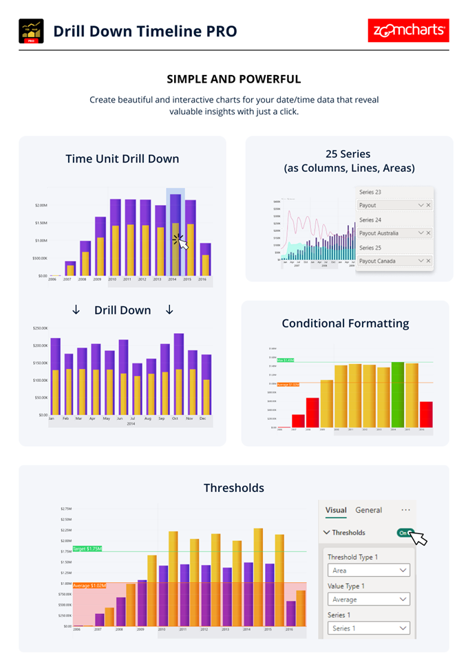
With Drill Down Timeline PRO, you can create slick and intuitive timeline charts with up to 25 series. Users can easily drill down by simply clicking data directly on the chart – for example, the initial view can show aggregated monthly totals, and the user can click on a specific month to quickly access daily values.
When paired with other visuals that support cross-filtering, Timeline PRO can become a part of a dynamic and engaging report that provides quick and all-encompassing insights to the user. For example, when you select a specific time range on Timeline PRO, other visuals will display data that’s relevant only to that time period. Conversely, other visuals or slicers can dynamically filter data on your timeline chart as you explore the report.
Main Features:
- On-chart drill down
- Up to 25 series (columns, lines, and areas)
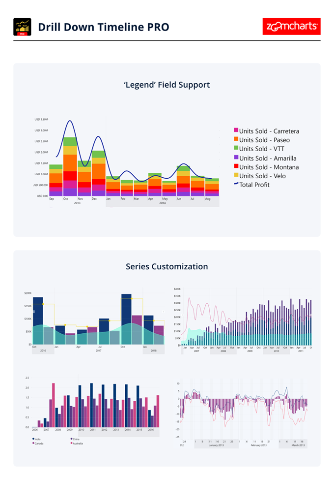
- ‘Legend’ field support
- Custom date/time hierarchy (from milliseconds to decades)
- DAX measure support
- Customization – defaults or individual series settings
- Up to 4 static or dynamic threshold lines/areas
- Conditional formatting
- Touch support
Get Drill Down Timeline PRO on AppSource
Attribute Control Chart by Nova Silva
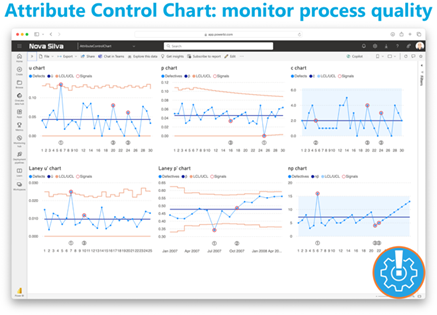
Maintaining quality standards is a non-negotiable aspect of every successful operation. Enter the new Attribute Control Chart for Power BI, a robust mechanism for monitoring and controlling categorical data variations.
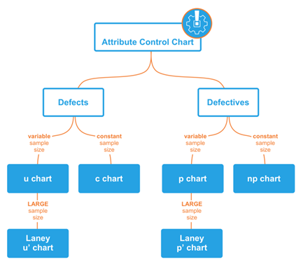
The Attribute Control Chart offers a comprehensive suite of six attribute charts to cater to diverse analytical needs:
- c chart: Monitors number of defects per sample (sample size is constant).
- u chart: Tracks the number of defects per unit (sample size varies).
- Laney u’ chart: A modified version of the u chart to adjust for overdispersion or under dispersion in your data.
- p chart: Observes the proportion of defective items per sample (sample size varies).
- Laney p’ chart: A modified version of the p chart to adjust for overdispersion or under dispersion in your data.
- np chart: Displays the count of defective items per sample (sample size is constant).
Power BI users can delve deeper into their data, facilitating timely decision-making and continuous improvement. From manufacturing to healthcare, the Attribute Control Chart equips organizations across industries with the insights needed to uphold quality standards and drive operational excellence.
Ready to experience the Attribute Control Chart? Download it from AppSource today and explore its capabilities with your own data – try for free!
Download Button by JTA
The “Download Button by JTA” is a custom visual designed specifically for Power BI users, empowering them to export large datasets effortlessly.
Key Features:
Enhanced Data Export: Download up to 300,000 rows and 15 columns of data in CSV format
Customizable Interface: Tailor the visual interface to match the reporting style
Constraints:
The custom visual leverages the browser’s cache memory. It works by fetching data in chunks of 30k rows, storing each chunk in the browser’s cache until the entire dataset is compiled for download. This incremental approach requires the use of browser memory to ensure seamless processing. Unfortunately, this means that the visual does not operate as intended in Power BI Desktop due to technical constraints and security restrictions within that environment and you must use the Power BI Service.
For the very same reason, there’s a possibility that it may encounter limitations or restrictions in certain browsers. Each browser has its own set of security measures and permissions that can affect how the visual operates.
If you liked what you saw, you can try it for yourself and find more information here.
Also, if you want to download it, you can find the visual package on the AppSource.
You can watch the video on YouTube!
New Updates for accoPLANNING (Release 69)
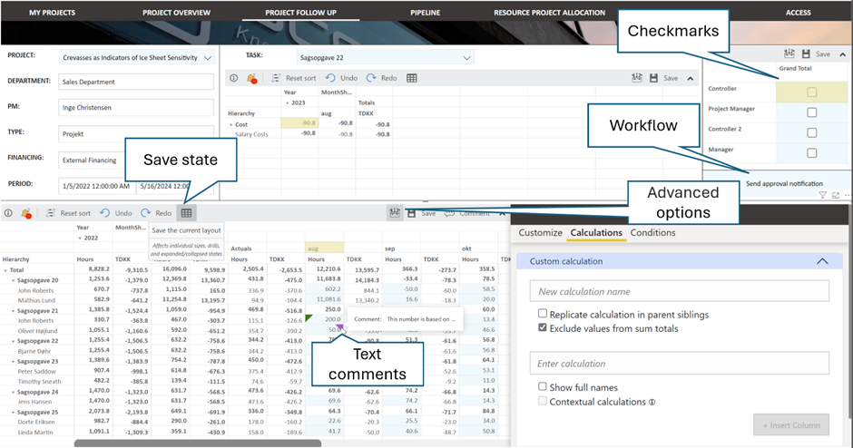
accoPLANNING for Power BI enhances your business capabilities with advanced planning, forecasting, budgeting, project management, and analysis solutions, all while enabling writeback capabilities.
Exciting New Features in This Release:
- Advanced Options and Save State: Customize column and row colors, adjust text formats, and create custom calculated rows and columns.
- Improved Settings Interface: We have completely revamped the formatting areas and relocated some settings to make them more intuitive.
- Writeback Table Scripts: Easily create writeback tables in your database for accoPLANNING visuals with this new feature.
- Dropdown List: Limit input to predefined values from a dropdown list – perfect for data validation.
- New Aggregation Options: They’ve added Median, Product, Min, and Max, among other useful aggregations for ad hoc scenarios.
- Enhanced Copy-Paste Functionality: Improved copy-paste capabilities between Excel and the visual.
- Themes: Quickly create visually appealing reports with new theme options.
- Self-Hosted API: Now available with enhanced data security features, including additional encryption.
- Fabric Ready: the visual now supports writeback directly to Fabric Data Warehouse.
By integrating accoPLANNING with Power BI, you can streamline your planning and reporting processes. For more details, visit the website.
Paginated Reports
Subfolder support in Power BI Report Builder
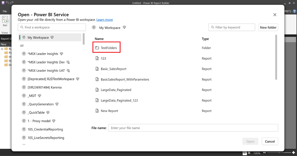
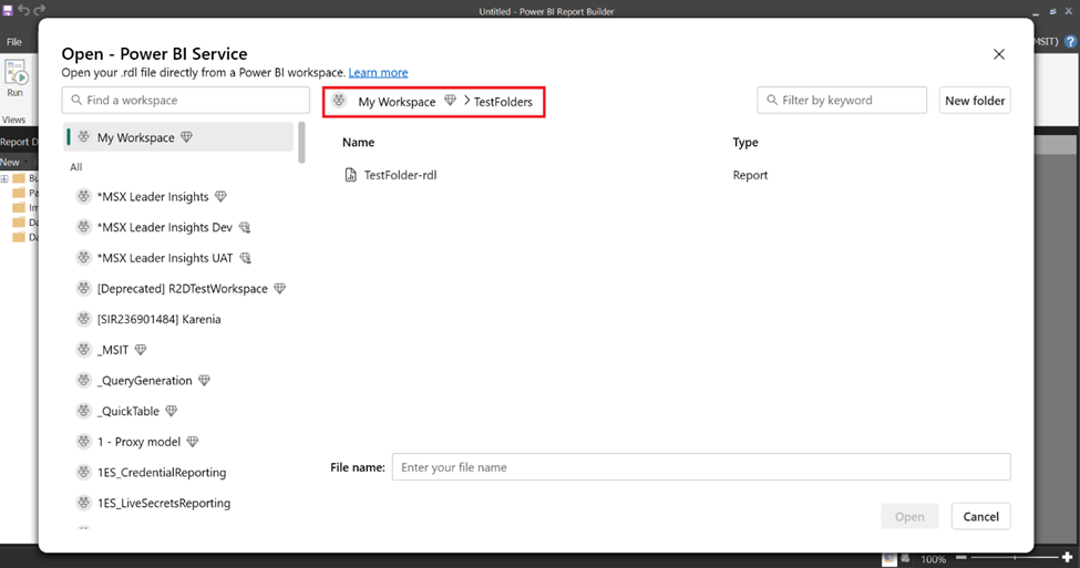
You can now open reports that are in folders and subfolders from Power BI Report Builder. These reports may reside in folders and/ subfolders in workspaces that the user has access to.
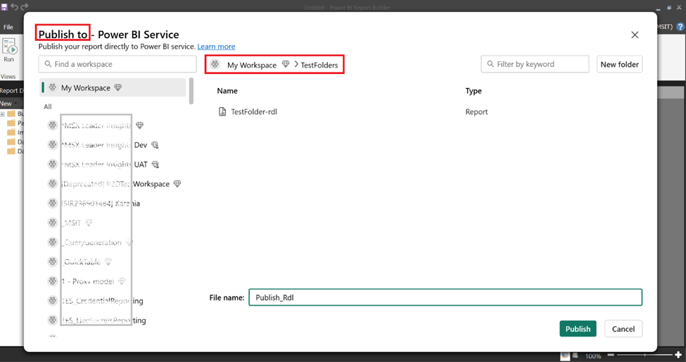
You can also publish paginated reports to folders/subfolders that you have access to in the Power BI service. Learn more about creating folders in workspaces.
Service
Master data – Public Preview
They previously introduced endorsement for Fabric items. Certified and promoted endorsements encouraged the use of standardized and trustworthy data. Now, they’re taking it a step further with the introduction of Master Data. This new endorsement stage empowers IT and data teams to define and establish the organization’s single source of truth. By defining Master Data, your organization can benefit from creating a repository of all critical organizational data, making it available to users with a variety of skills to discover and build upon. Learn more about Endorsement and how to enable Master Data in your organization. Master Data endorsement is available to any item type that stores data (e.g. Lakehouse, Warehouse, Semantic model).
Note: Master Data feature rollout will be completed by the end of the first week of July.
OneLake
External data sharing public API
In addition to the public preview of external data sharing announced last month, they have announced the public preview of APIs for external data sharing. Users can now scale their data sharing use cases by automating the creation of shares with the public API. Click here to access the API documentation.
Synapse
Data Warehouse
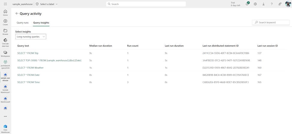
Query activity: A one-stop view to monitor your running and completed SQL queries
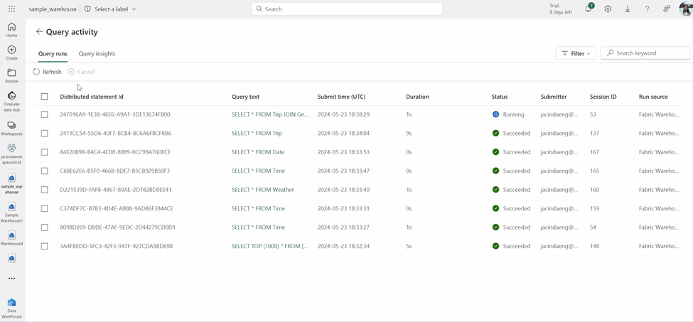
Query activity, a one-stop view of your running and completed SQL queries for workspace admins has been announced! Monitoring SQL queries is essential for maintaining the performance and efficiency of the warehouse to ensure that queries aren’t taking longer than expected to execute and are completed successfully. This feature enhances your ability to monitor queries from your Data warehouse or Lakehouse SQL Analytics Endpoint without having to run any SQL code!
There are two ways you can launch the Query activity experience:
Click on More Options (…) next to the warehouse you want to monitor within the workspace view and select Query activity.
Once you are within the query editor, click on Query activity in the ribbon.
On the Query runs page, you can filter your queries from a specific status, submitter, or submit time and cancel any long-running queries that you would like to stop the execution of.
On the Query insights page, you can see a list of long running queries and frequently run queries to help determine any trends within your warehouse’s queries.
To learn more about Query activity, please refer to the documentation at: Monitor your running and completed queries using Query activity and blog.
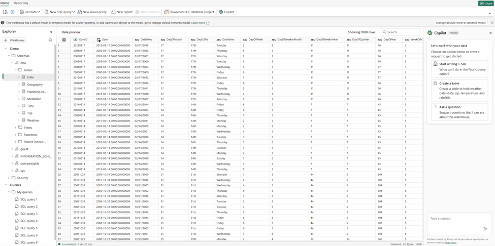
Discover Insights, Patterns, and Trends with Copilot for Data Warehouse
Copilot for Data Warehouse at //Build last month has been announced. Sign up here to enable Copilot for Data Warehouse in your organization today!
Following up on this announcement, the ability to brainstorm questions with Copilot for Data Warehouse has been announced! Developers and analysts can now leverage Copilot to help discover insights, data points, and trends that are personalized to your warehouse’s schema and metadata. Click the Ask a question button or simply ask Copilot to “suggest questions to ask” to get started:
Mirroring Azure SQL Database
They have added more SQL’s Dynamic Definition Language (DDL) support for tables being mirrored. You can now perform Alter Table, Alter column, and change from one datatype to another supported datatype.
Data Engineering
Spark Connector for Fabric Data Warehouse (DW)
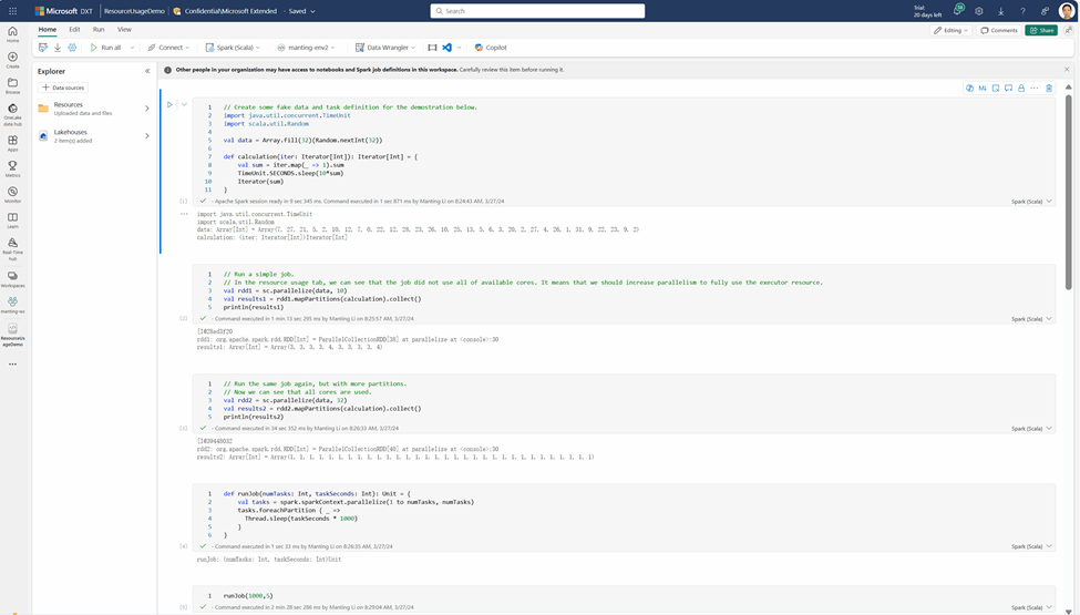
The availability of Fabric Spark connector for Fabric Data Warehouse (DW) in Spark runtime has been announced. This connector will empower a Spark developer or a data scientist to access and work on data from Fabric DW and SQL analytics endpoint of the lakehouse (either from within the same workspace or from across workspaces) with a simplified Spark API. It hides the underlying complexity involved, automatically discovers the SQL endpoint based on the context of the specified warehouse/lakehouse and literally works with just one line of code.
This connector has been designed to keep security in mind and takes a minimalistic approach. Hence it requires minimal permission to work with Fabric SQL engines and honors security models (like Object Level Security (OLS)/ Row Level Security (RLS)/ Column Level Security (CLS)) defined at the SQL engine level while accessing a table or view.
The connector will be shipped as a default library within Fabric Runtime and no separate installation will be necessary to make use of it.
To learn more about Spark Connector for Fabric Data Warehouse (DW), please refer to the documentation at: Spark connector for Fabric Data Warehouse
Notebook column resizing on display () table view
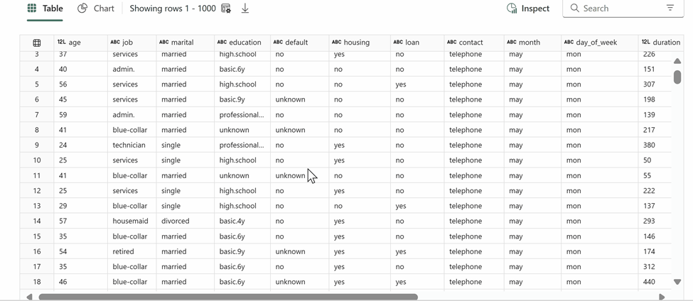
The built-in rich dataframe table view on Notebook now supports column resizing! You can use the display(df) command to explore your data and try out the new column resizing experience.
Notebook pane switcher
They recently introduced pane switcher on Notebook, which is a new interactive component to manage your opened panes! With the pane switcher, you can open and use multiple panes at the same time without worrying about them taking up extra Notebook canvas space, it can help you focus on programming while leveraging the rich functions Fabric notebook provided, such like Copilot, browse code snippet, find & replace, comment, etc. You can also easily navigate among each panes embedded in the pane switcher and close them one by one.
Real-time Intelligence
Effortlessly Pin Query Results to Your Dashboard: Streamline Insights and Collaboration
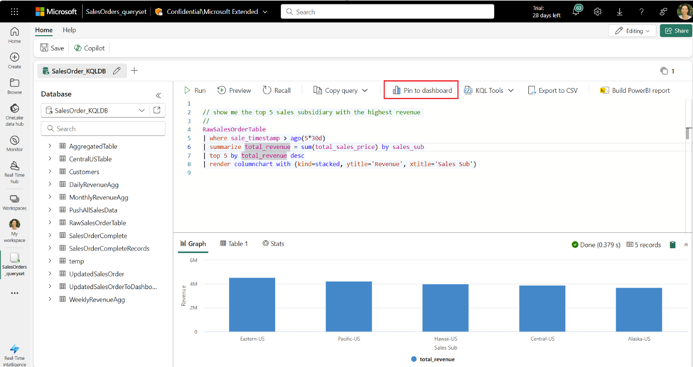
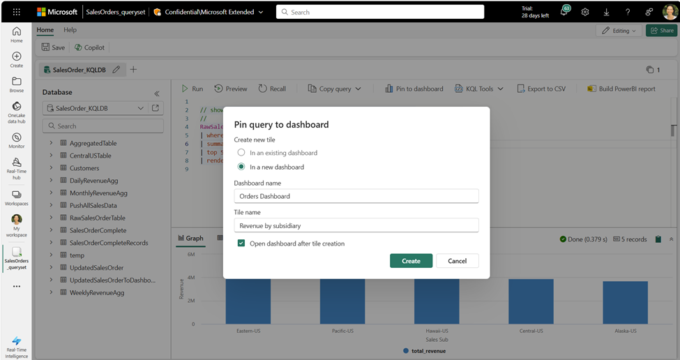
Introducing the ability to run queries in a KQL Queryset and pin the results directly to your Real-Time Dashboard, whether it’s new or existing. This functionality streamlines the insights analysis process, allowing you to quickly transform raw data into actionable insights. By pinning query results, you can effortlessly build and share comprehensive dashboards with your team, enhancing collaboration and decision-making.
Unleashing the Power of Graph Semantics in Eventhouse
The general availability of the Graph Semantics in Eventhouse has been announced. This groundbreaking feature allows users to model their data as graphs and perform advanced graph queries and analytics using the Kusto Query Language (KQL). With support for various graph types, such as directed, undirected, weighted, and labelled graphs, the Graph Semantics extension provides a comprehensive set of graph operators and functions to help users gain deeper insights into complex datasets.
Data Factory
Dataflow Gen2
Certified connector updates
The new and updated connectors has been announced in this release:
- [Update] BitSight Security Ratings
- [Update] Supermetrics
- [Update] Wolters Kluwer CCH Tagetik
- [Update] LEAP
- [Update] MongoDB Atlas SQL
- [Update] Denodo
- [Update] Zendesk Data
- [New] Intersystems Health Insight
Data pipeline
Use Data pipeline to read and write to Lakehouse table with schema information (Public Preview)
With the release of the Lakehouse schemas feature, available for public preview on June 28th, data pipeline will now support reading the schema info from Lakehouse tables and will support writing data into tables under specified schemas.
New connectors are available in data pipeline
More connectors are now available for data pipelines:
- Azure AI Search
- Azure Cosmos DB API for MongoDB
- Azure Files
- Dynamics AX
- Google BigQuery
- MySQL
- Oracle
For more information on data pipeline connectors, please read Data pipeline connectors in Microsoft Fabric.
Move Data Across Workspace via Data pipeline Modern Get Data Experience
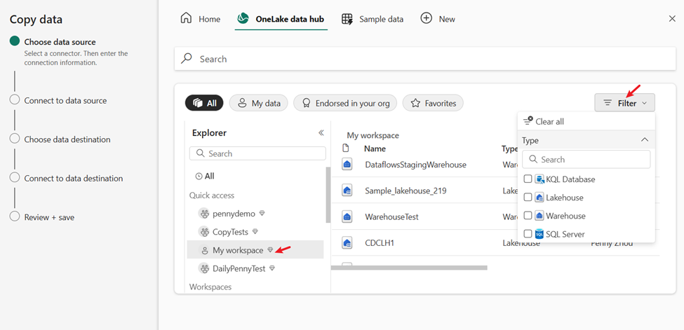
They are now introducing the native capability that allows you to easily move data among Lakehouses, warehouses, etc. across different workspaces.
You can intuitively select Fabric Lakehouse, Warehouse, etc from another workspace under the “Explorer” on the left side of the “OneLake data hub” in Pipeline Modern Get Data. It also lets you filter by artifact types.
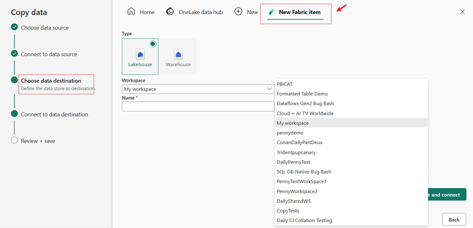
Besides selecting existing Lakehouse and Warehouse across various workspace, you can also easily create a new one in a different workspace.
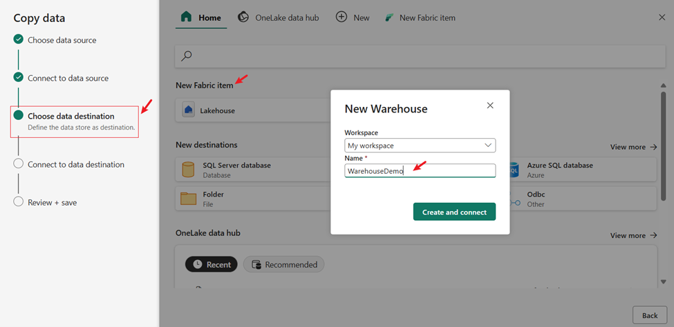
Support to create a new Warehouse as destination in Data pipeline
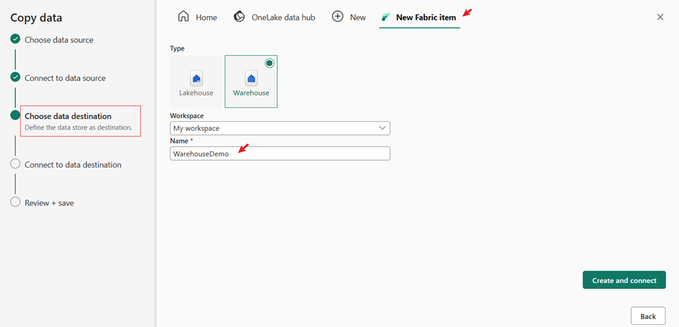
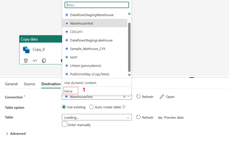
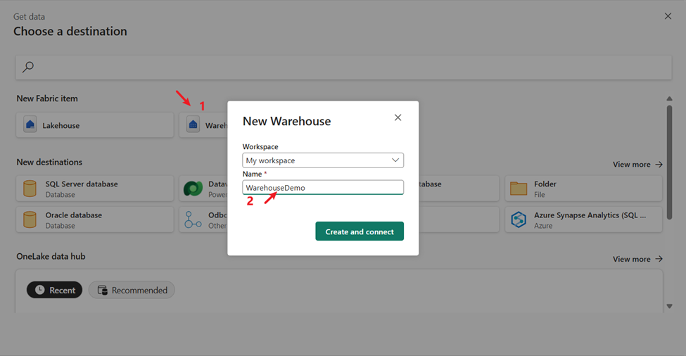
You can now create a new Warehouse as a destination in Data Pipeline, instead of only selecting an existing one. This feature allows you to load your source data into Warehouse more easily and intuitively.
You can easily create a new Warehouse as your destination in the “Choose data destination” step of Data Pipeline Copy assistant. You can find this option in the “New Fabric name” section of the homepage, or in the “New Fabric name” page.
You can also easily create a new Warehouse in the “New Fabric item” section when you edit the destination of Pipeline Copy activity.

