Building and maintaining Power BI reports and dashboards can be extremely time-consuming, not to mention stressful. This is especially the case when you have to do this over and over again. Luckily it doesn’t have to be that way! This tutorial outlines some of the best practices and step-by-step Power BI productivity features that work like magic.
We will look at how to group and copy elements, copy formatting and even get into the black magic of using JSON files to customize every last bit of your designs.
Note: This Power BI productivity tutorial is based on their 1-hour webinar on the same topic. If you prefer to watch the video, scroll to the bottom of this tutorial, enter your details and they’ll send you the webinar recording and all PBIX examples to go along with it.
Structuring your reports in Power BI
As you build dashboards and reports in Power BI, they can get quite complex with many pages and features. This leaves you facing two challenges.
The first is how to design for the navigation between the pages? The second challenge is how to reuse these complex pages to create reports quickly?
A possible response to the first challenge is to use the drill through functionality. This allows you to click on a category to get to a more detailed page.
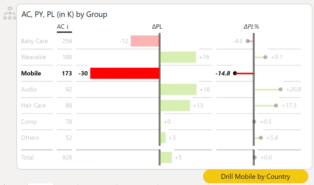
In our example, the mobile business unit is not performing very well. If you hover over it with your mouse, a report page tooltip is displayed. Once you click on the table, the drill-through button appears. CTRL+CLICK on it to visit the more detailed page.
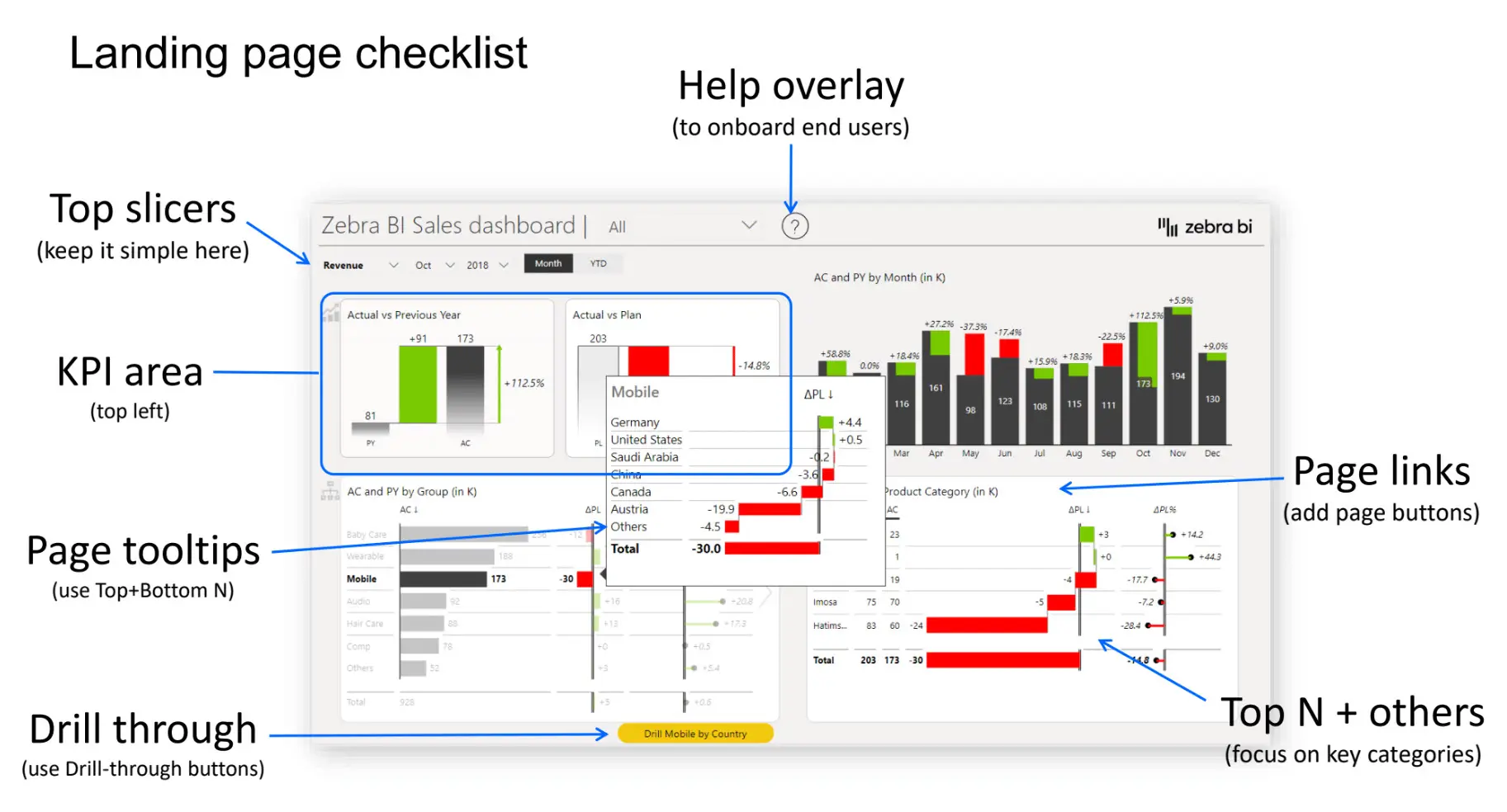
The second challenge is, of course, that you have many detailed pages like this. Even simple reports can have tens of pages. Each of these pages has multiple different elements like buttons, text boxes, images, slicers, visuals, etc. Below is a sample of just one page and its many elements. You might have even more on a page.
Two-level Design Pattern
Before we dive into the nitty-gritty details of Power BI features hands-on, we’ll share with you the dashboard design pattern that we’re using at Zebra BI. This is a two-level design pattern. The first level is an overview on a homepage with all of the bells and whistles, such as help overlays and attractive visuals:

This overview page can take a lot of time to design because you need to think a lot about the structure. You should think about your target user, the main KPIs that they need to see first, the elements that will explain performance in the best way possible, the data categories that must show up on the first page, etc.
While it might take some time it pays off to design it right with nice features. After you design your homepage, you may have 30 other detailed report pages left. These are the pages where you land once you click on buttons, drill through, or use other types of navigation. Since this is a lot of pages, you need to make sure that you have building blocks of these pages ready, so you are easily able to copy and paste them. Once you have them ready, you can quickly build reports even if you start to design from a completely blank page.
Let’s take a look at what you need to build a report page. Start with thinking about the page header. This is the top section of the report that contains elements like the title, logo, back button and even page tabs. These tabs or buttons can be used to navigate between pages that are related to the same topic. This is then followed by the slicers, along with everything else that is the content, visuals, comments and more.
Here is an example:
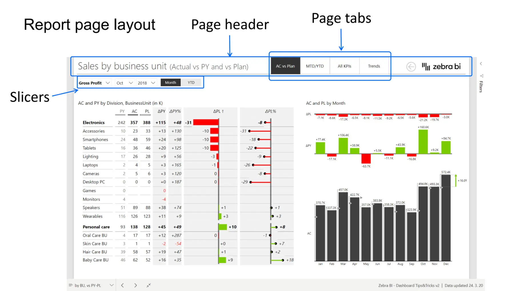
Keep this picture in mind as we go forward. Now let’s go back to our dashboard.
Selection pane will boost your productivity
While you’re building and once you’ve finished making your report, make sure to check what is behind it. You should always be in control of what and how many elements are present within your report and you should pay attention to their relationships. The best way to keep track of this is to enable the Selection pane to check how your page looks like behind the scenes.
How to enable the Selection Pane. Open your Report. From View Tab > Check the Selection Pane. The selection Pane should be shown and list all the visualization parts on the current report page.
Just keeping the Selection pane open while working in Power BI will make your life much easier.

For example, sometimes it’s hard to click on some elements in Power BI because they are small or overlapping. Instead of hunting all over the screen with your mouse, you can just use the Selection pane to select the element you want to edit, copy or delete.
Starting to build a new page
As you start building a new page, you usually open a blank page and start adding all the necessary elements, like four-page tab buttons. You immediately hit the problem with Power BI default settings, which is that the default design of the buttons does not really respond to user action. You can make this better by enabling the fill and changing color on hover. Be careful to not overdo all design options, if you want to keep your report minimal and clean.
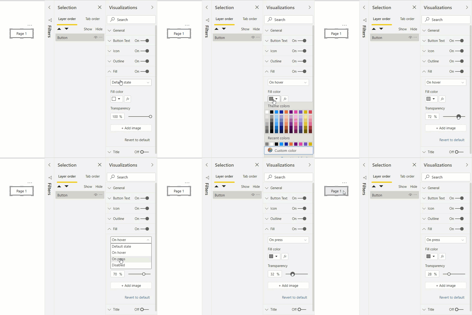
You usually need multiple buttons (four on our example page). The easiest way is to simply copy and paste the first one we create. After all, it takes less time to change one or two properties of a button (or any other element) than to create a new one every single time. Using keyboard shortcuts, like Ctrl+C (copy) and Ctrl+V (paste), will also make you more productive in Power BI.
But now the problem is we’ve only done this for the first button what about the other three? And if you have 30 pages to design, this approach might not work that well. Imagine setting the hover action for hundreds of buttons.
Format painter is your friend
This leaves us with two options: The first option would be to delete any buttons we have created and copy and paste the first one. However, you might have already set actions and text and everything else for a button, so you don’t want to delete it and do this over and over again. One way to address this problem is to use the format painter.
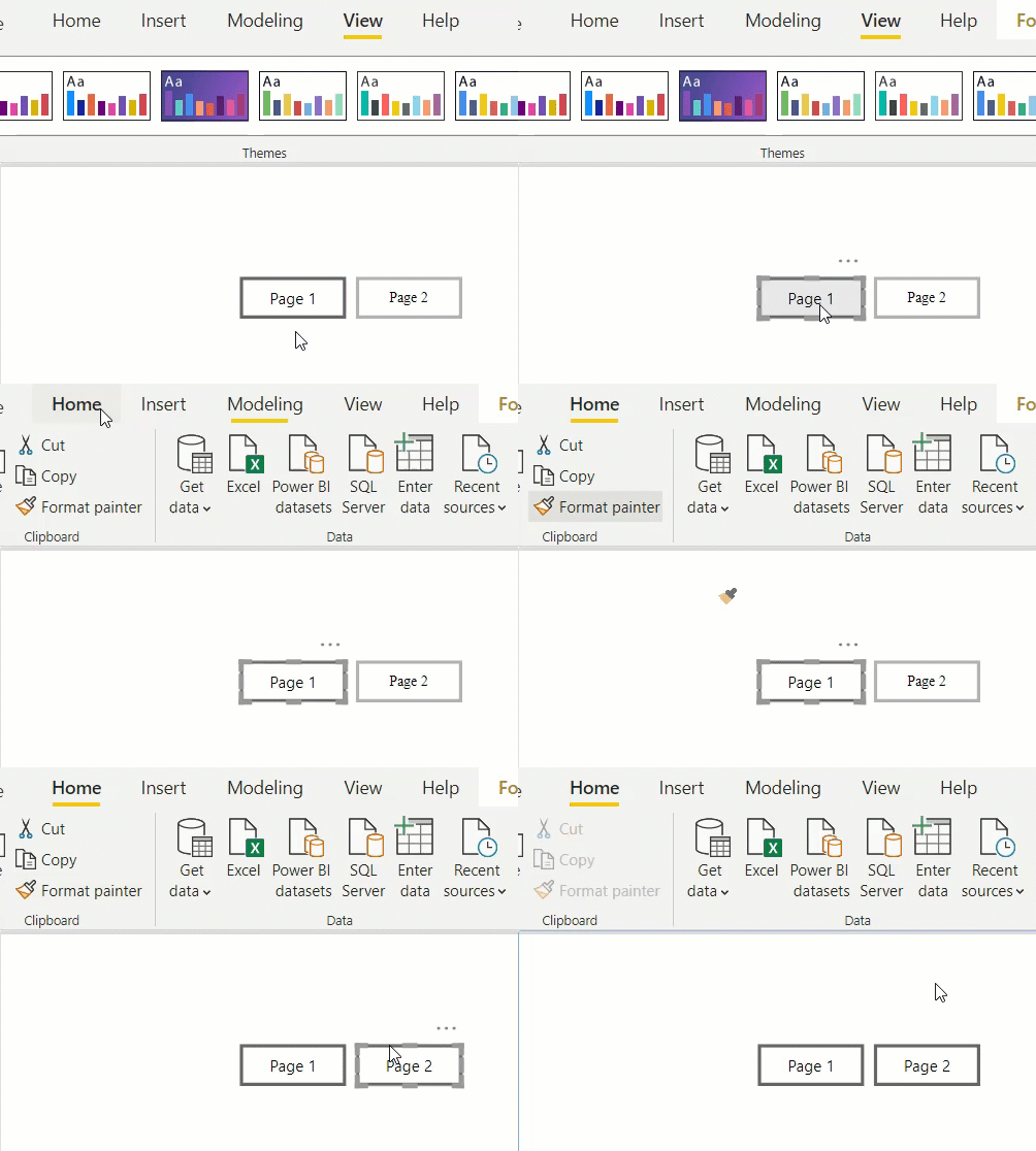
If you want to copy the design of one button to another, you can just select the button you want to copy properties from, go to the Home tab and click on the Format painter icon. Then go over the button to which you want to apply copied properties and click on it. This now makes the new button behave the same as the one from before. In short, this will paint the style from an element to another element, while keeping text and links the same.
Building the first page
Now we can go and create some content, like charts and slicers. Slicers will help us switch charts between years, so we can do a more detailed comparison.
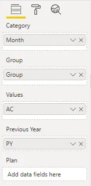
Add a Zebra BI chart and add AC and PY values, then group them by Group and add the Month category.
Then add a slicer so you can control the year for which the data is displayed. Drop the Year field on your workspace and change it into a Slicer from your Visualization pane. Then select the Dropdown type for the slicer.

You could also turn off the slicer header. When it comes to changing calendar dimensions, the label “year” on the slicer might not even be needed, as the numbered years are already very self-explanatory. This will allow you to gain more space on the page. You can even use the format painter to copy the style from one slicer to another (just like with buttons), so you won’t have to manually remove the title on each one.
First of all, design one page really well. You can then use it as a template for the upcoming pages.
Reusing your elements
Now, if you start building a second page, you can copy multiple elements at the same time by holding the Ctrl key, clicking on the elements you want to select and then just copy and paste them to a new page. However, could result in a lot of copy-pasting. And you don’t want to do that.
One solution is to just copy the entire page. You can do this in the pages tabs below, right-clicking on the desired page and select Duplicate the page. It’s much easier if you have one page already set and most elements are already in place.
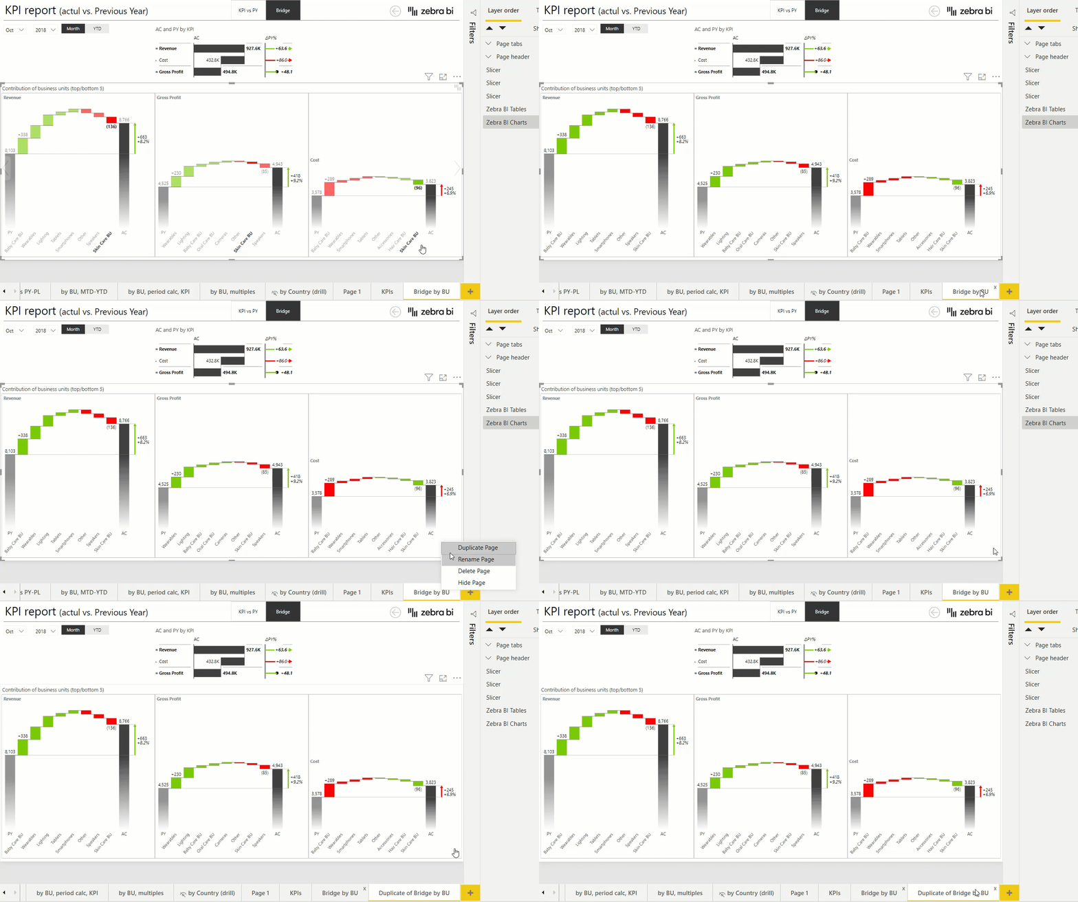
When you have two pages and you change something on one page, you’ll still need to manually apply the same change to the other page. And if you have multiple pages already made, it gets really tedious to copy and paste a recent change to all other pages. So how do you deal with this?
Grouping elements together
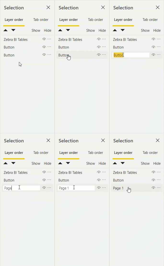
First of all, in the Selection pane, name all the elements. When you start out, they all have the same generic names: button, image, slicer, button, button, slicer … You get the idea. Start by giving them a good name, so that you will understand them and if somebody else will work on this report at some later point, they will also understand what are the actual elements. You can easily rename an element by double-clicking it in the selection pane.
Second, to make the Selection pane even clearer, you can also group elements. For example, you can group all page tabs into one group, which you can then also rename. You can select multiple elements by holding the Ctrl button on your keyboard and clicking the desired elements. Then right-click onto them and select Group. We recommend doing this with all the elements that have a common function. Now, instead of copying every element by itself, you can easily copy groups between pages.
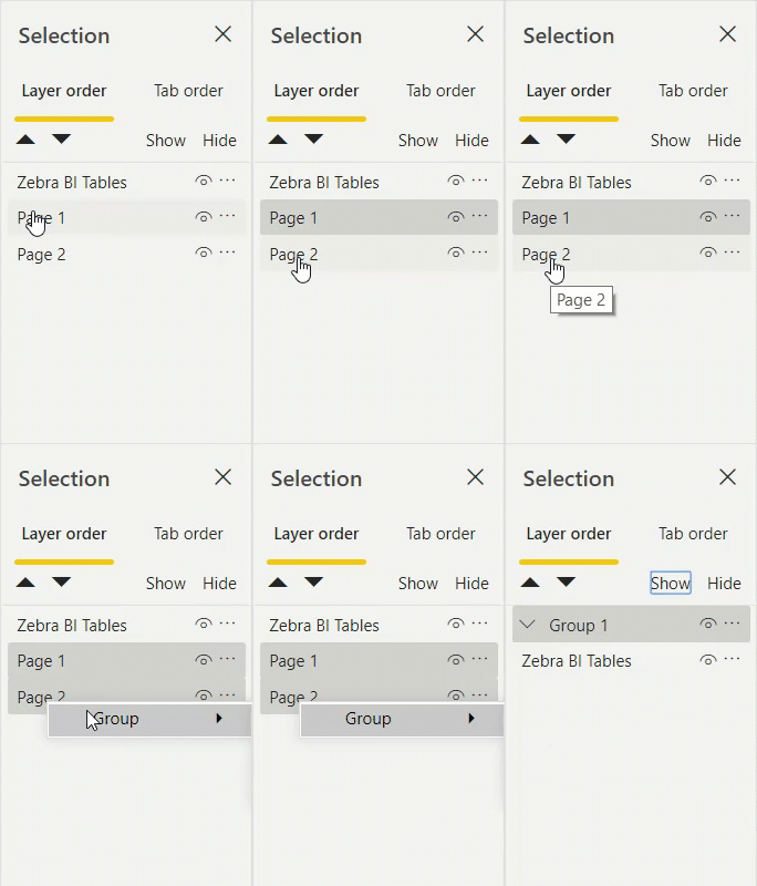
Grouping also helps if you have many elements layered on top of each other, which makes it very difficult if you want to select a specific element below others. With the Selection pane, you can easily highlight the specific element you want to manage, without needing to move other elements above it away and then back again once you’re finished.
Keep it simple
We would definitely recommend you to first shape one page really well. Start on page number one, and create as many properties as you can. Once you have everything ready, you can then use this page as a template. Because if you have one page already done, then within the same file, you will simply duplicate the page and just remove or change the few elements you want to make different.
It’s easier to adapt an already-existing page and just change the content, than to build page after page from scratch.
You don’t necessarily need to have each page completely different. Actually, it’s much easier for you to stick with a few different report page types, because it will be easier for you to reuse them, but at the same time, it will also be easier for the end-user. Because they will quickly come to understand it, they’ll get more or less the same organization of information, with a similar layout. So, standardization is really key.
Themes and Styles
While the tips so far should already help you a lot, you can still take your reports to the next level. And the best way to do this is by using styles and themes in Power BI.
For example, the way how a button in the report currently behaves is only applicable in this report and in the pages where you actually copied the button and used the behaviour and style.
However, using a theme in Power BI will help you to just do this once for every button, everywhere, in all of your reports at once.
Note: If you’re interested in learning more about custom themes in Power BI, here’s a 2500-word tutorial on the topic: Power BI Themes.
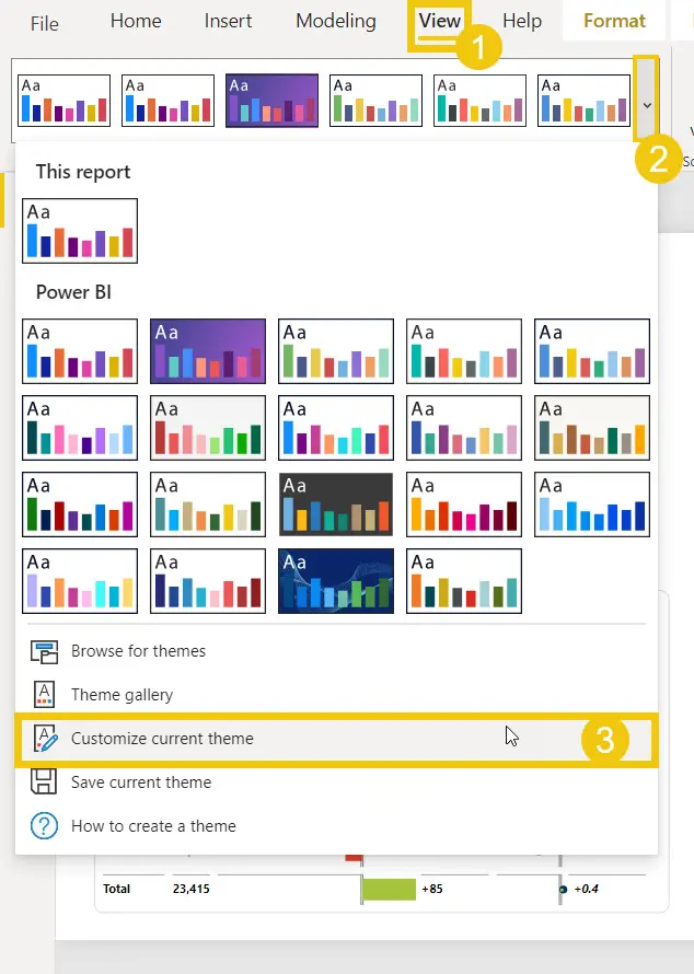
You can edit a theme by going to the View tab, open the themes menu and selecting Customize current theme. This feature allows you to edit colors for a lot of elements on multiple levels, along with text styles, font families, visuals, background, borders and the page and wallpaper as well.
You can customize most elements of the theme, such as colors, text, backgrounds and other visuals, pages and the filter pane. For example, if you want to set a different default wallpaper, click on the Page category and then set the color and the transparency of your wallpaper. After you’re done, simply click Apply. This change will be applied to all your pages, so you don’t have to edit them manually.
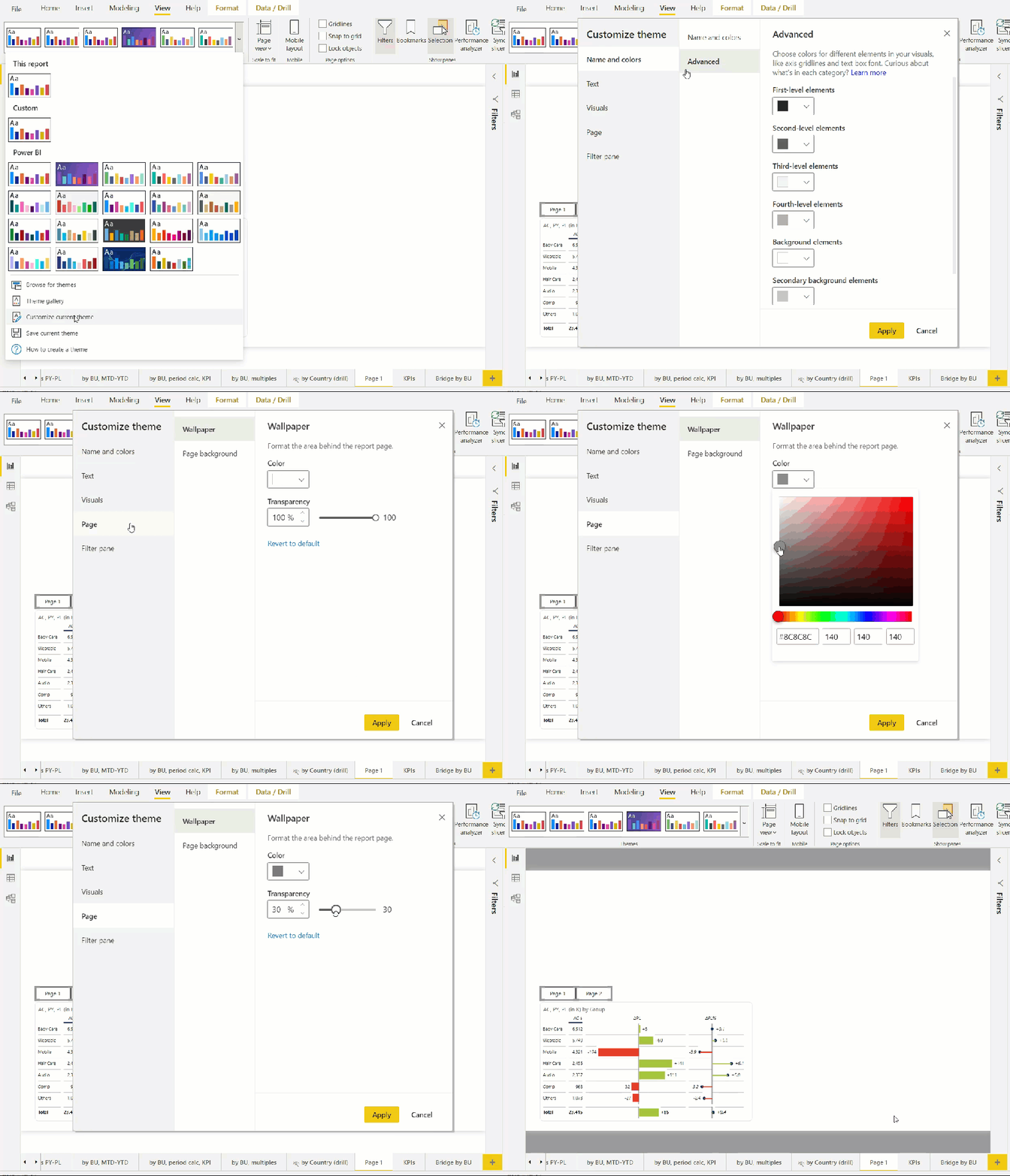
Now if you add a new page, this change will already be applied and it’ll even work for all of your previous pages, unless you already clicked and customized it yourself in the visuals. The way how the themes work in Power BI is they will change the default colors and all settings that you did not explicitly change before.
If you are really satisfied with your current theme and would like to apply it to other reports, past and future, you can export the current theme, and then import it into your other reports. Exporting a theme will create a JSON file, which you can further customize outside of Power BI. However, we don’t recommend this if you don’t already have any previous experience with coding or similar projects.
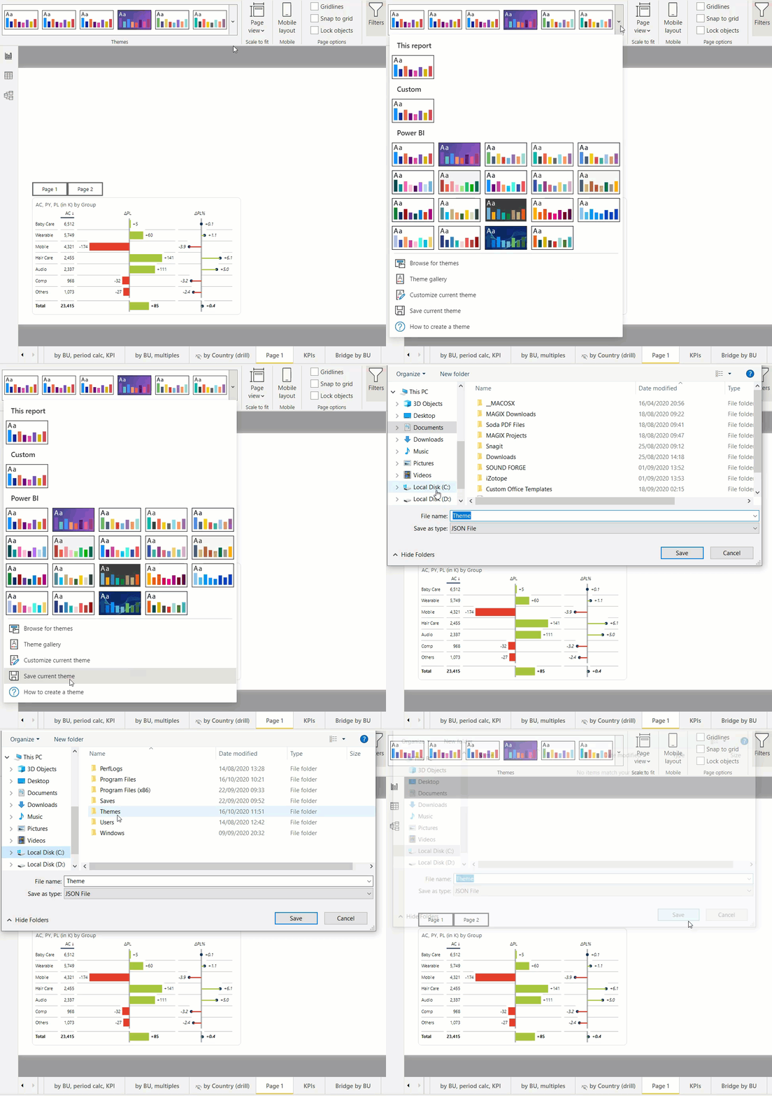
It’s a very technical thing; you need a code viewer so you can effectively display the JSON file, and you need to be quite careful with the commas and curly brackets and other parts. If you’re a developer or working in the IT field, it should be completely fine. But for business users, while you can still play around, it’s not very user-friendly.
To open the JSON file, we recommend using the Visual Studio Code program, which you can download for free. With it, you can now manually change any kind of setting.
Editing a JSON file
If you do decide to open your JSON file in Visual Studio Code, it should look something like the image below. As we said, it can be intimidating at the start, but if you know what you are looking for and what do you want to change, it then becomes a very powerful tool.
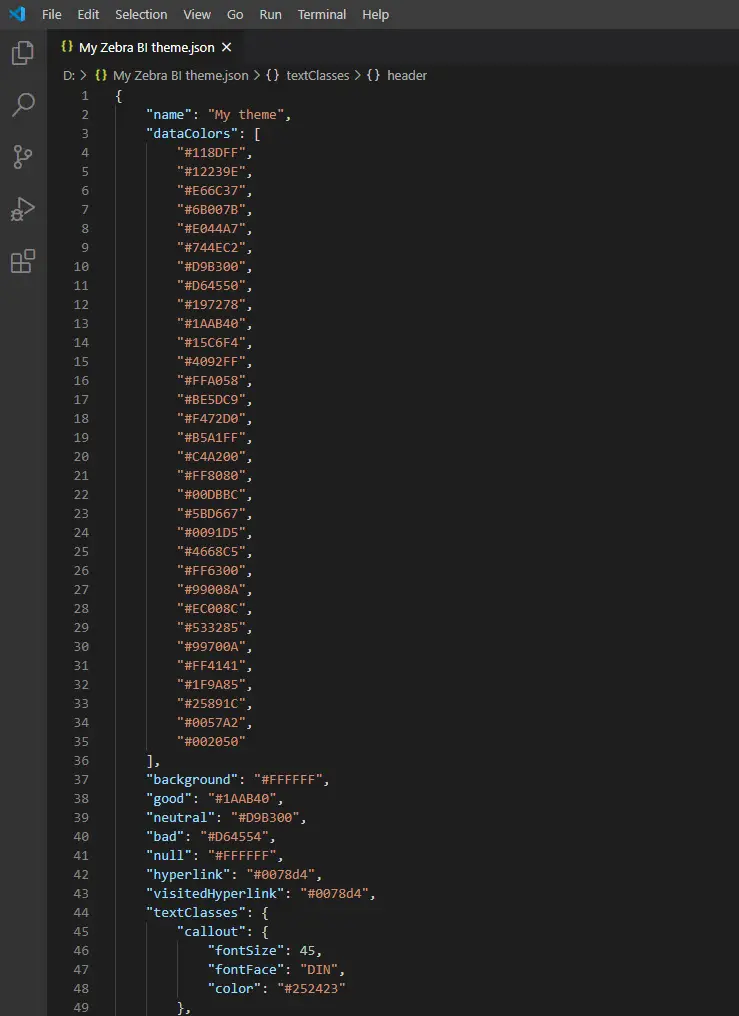
Now you can change almost any kind of setting you want.
For example, using Zebra BI visuals in the report below, you can notice some business units with a lot of sales, along with some really, really small ones. Such examples are very common in financial reports and can often happen with your data as well.
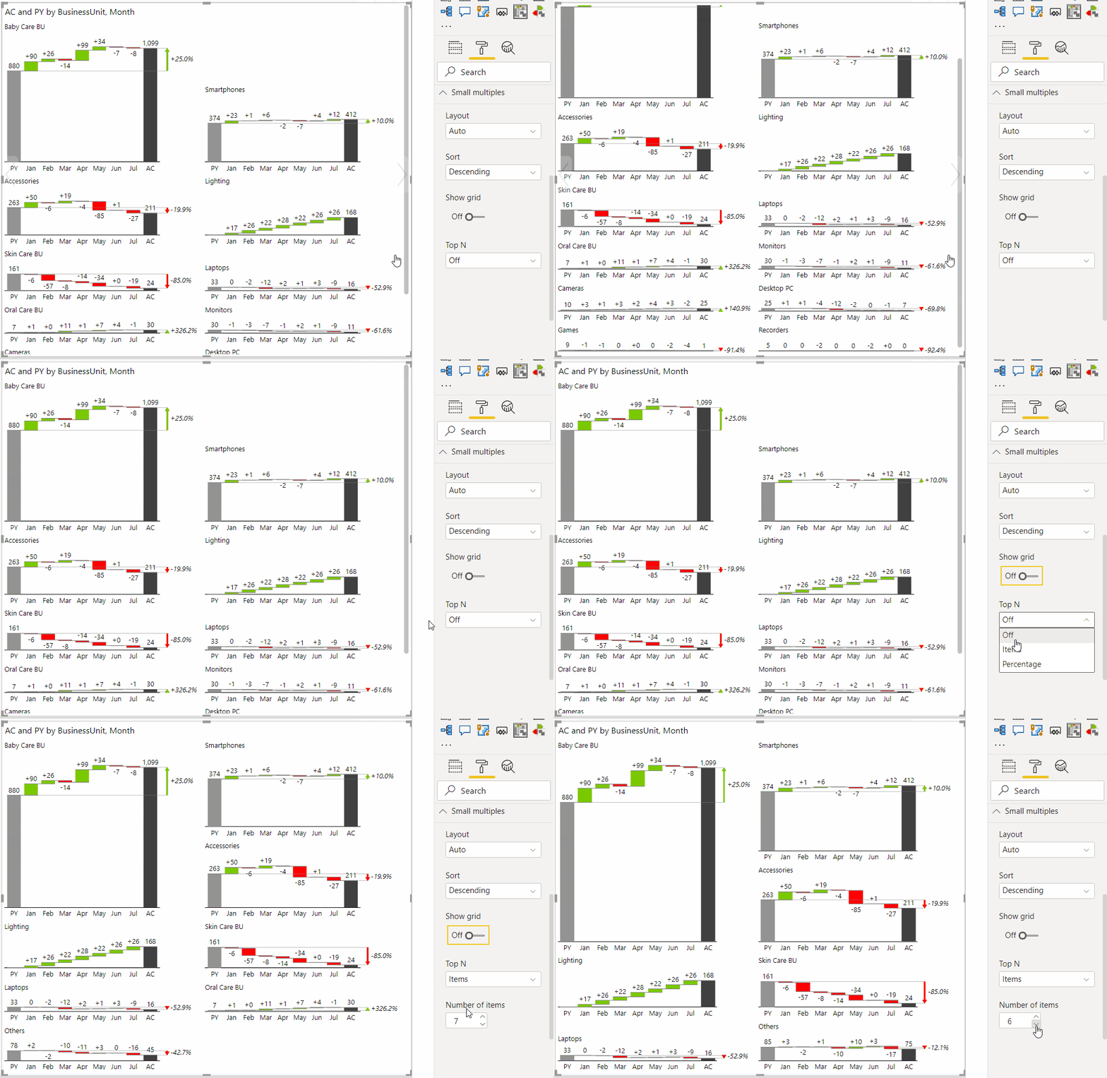
To tackle this issue, you can enable the Zebra BI Top N setting, which shows only the categories that have the most impact on your business. In the Visualizations pane, select the small multiples category and enable the Top N feature. This way you can select to filter out a certain number of items and change the layout of small multiples.

Using JSON to set default behavior
While this is a great feature, the trouble arises when you want to enable this setting by default, with each of your reports. And when you have numerous charts, on numerous pages where you want to display the Top N, that takes a lot of time. Now, however, you enable this feature for every chart, from one place: Your theme.
Of course, you need to know the exact name of the property to manage the small multiples, and that can be a challenge. The documentation can be quite difficult, especially if you hadn’t done something like this before.
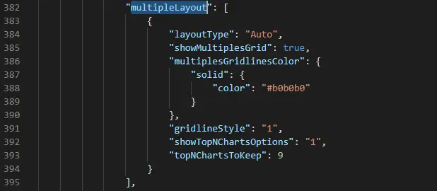
For this specific example, find the “multipleLayout” property, from where you can edit things like the layout type, whether to show Top N charts and exactly how many. The settings shown below will Show top N charts by default and the number of charts shown will be 9.
Hint: Just like in your browser or other programs, you can search for a specific text within the document or a page by pressing Ctrl + F and typing the text.
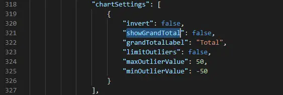
For another example, you can set that charts to show the Grand total by default. So if you, or your company, just prefer to always display the Grand total, you can also set this in the theme, instead of changing it for every visual separately. Again, just find the proper setting within the JSON file and change it according to your personal preferences. In this particular case, the setting is designated as “showGrandTotal”, which you can find under “chartSettings“. You simply set it to “true” and you’re done.
After you finish with all specifications, save the JSON file and go back to Power BI. Now you can finally, instead of going through all of the settings with your mouse, just import the theme that you created for yourself. Go back to the Themes menu and click Browse for themes. Find the JSON file you have just edited and open it in Power BI. This will now apply all the modifications you have made in the theme, to your report.
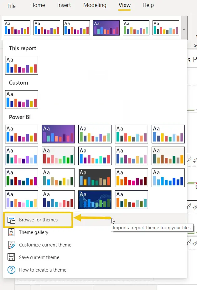
Even more important than changing the colors, you can use this to easily control any kind of chart properties, default names, and many other functionalities.
Zebra BI Style Editor
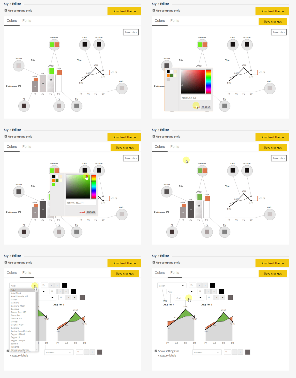
For the subscribers of Zebra BI, if you have the pro license, you can also access our own Style Editor when you log into your Member Portal. Scroll down and check the Use company style option. You can use this to determine even more properties of visuals, without the need to drown yourself in a JSON file.

You can now change colors, lines, markers, font family, and many other elements of the Zebra BI visuals. After you’ve finished customizing it, you can simply click Download Theme as a JSON file that you can then import into your Power BI report.
Increase your productivity with Power BI templates
Even better, once you style all your elements and are satisfied with your settings and design, you can now go and save this file as a Power BI template. So instead of saving it as a PBIX file, a Power BI file, you can set the file type to be Power BI template file (PBIT). Power BI will export this as a template, which means all of your styles, all of your elements, all of your charts, even the custom visuals like Zebra BI, will all be stored in this file, as well as your customized theme.
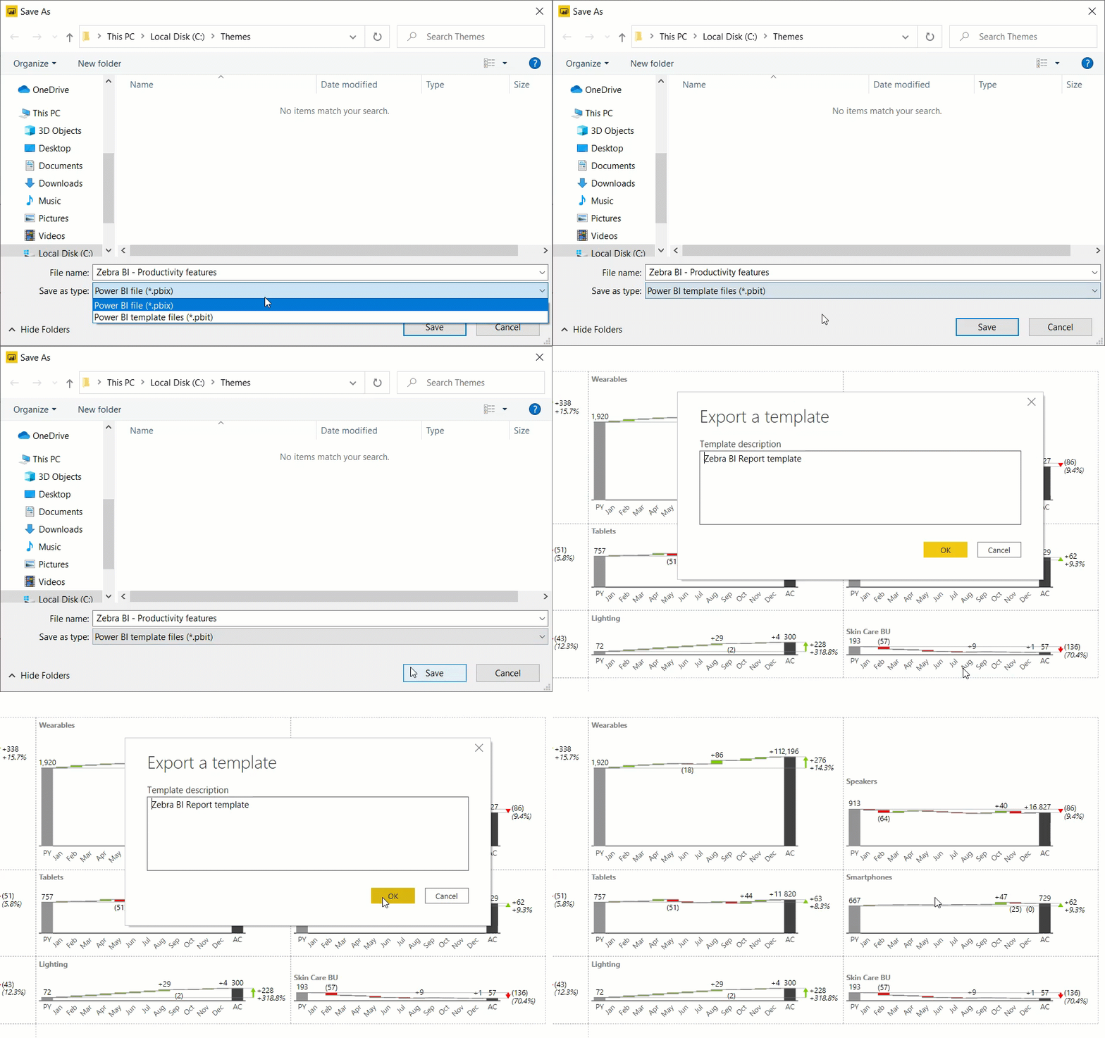
With Power BI template, you can now also decide whether to allow the data connection or not. This means you can either keep the visuals and all data or just use your visuals on a completely new set of data.
Source: Zebra BI Blog

